
Know What UX KPI Metrics to Track & What Those Metrics Are Telling You…
Delivering a great user experience (UX) can be a very artistic process filled with creative touch and feel, intuition, beautiful storytelling and enthusiastic collaboration but once your website or software is up and running, how do you know it’s working?
How do you know all your hard work is paying off and you are delivering an effective user experience? Yes, revenue and profit are obvious key performance indicators (KPIs) but that isn’t exactly an accurate reflection of your UX.
So, what are the UX KPI metrics that are going to give you an accurate depiction of how good your UX is and what areas are working or not working? Glad you asked! Here are some UX KPI metrics that will help you measure the success of your UX.
UX KPI Metrics: Conversion Rate
A conversion rate is a simple formula – it’s the percentage of your visitors who complete a conversion out of the total number of your visitors multiplied by 100. The conversion (or goal) could be a number of things:
- Purchasing your product
- Filling out & submitting a form
- Calling or emailing you
- Signing up or subscribing for something
- Downloading content
- And nearly anything else that helps your business grow
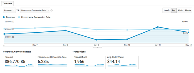
A good conversion rate varies by your industry, traffic volume and what action you are qualifying as a conversion. The average conversion rate for the US currently stands at 2.63%. Below is a an actual look at an industry-leading company’s Google Analytics. This gives you a bit of insight on the effectiveness of an above-average conversion rate.
I recommend establishing a benchmark and then trying to steadily grow it over time. So, if you start with a 2% conversion rate, great! But if it’s at 2% in 6 months or, even worse, dropping, then you aren’t successfully growing your business.
As far as a conversion rate being a UX KPI metric, having a conversion rate you or your department head finds disappointing can be connected to a few UX elements. I’d look at usability, findability and accessibility.
If your traffic is good but your conversion rate is uninspiring, then check:
- Findability – Is your users finding the information they need or the call to action with ease?
- Accessibility – Is there anything hindering their ability to access the conversion action?
- Usability – Is the checkout or form fill process smooth and easy to execute?
To pinpoint the reason why your conversion rate is low and if it relates to UX, you can A/B test different variations of your CTA, get customer feedback via a survey or use a tool like Mouseflow to observe and review customer behavior.
UX KPI Metrics: Net Promotor Score
A net promotor score (NPS) is considered by many as the ultimate way to judge your customer’s opinion of your company or product at a large scale. The score derives from one single question – “How likely is it that you would recommend [Organization X/Product Y/Service Z] to a friend or colleague?” The respondents give a number from 0-10 with 0 being “not at all” and 10 being “extremely likely.” The final NPS will give you a benchmark on customer satisfaction.
A score you find unsatisfying can serve as a telling UX KPI metric. This is especially true if you’re selling online services/software. It can tell you:
- If you are providing the tools and layout that helps your customer accomplish their goals (useful).
- If you’re offering a user experience that is usable IE is the software/service easy to navigate and are the tools easy to utilize.
Once again, it is best to test and survey users on these subjects to see if you can learn new information, evolve your product and then you can refer back to your NPS (aka your UX KPI metric) to see if your changes are making a difference.
UX KPI Metrics: Abandonment Rate
Abandonment rates are most commonly used by call centers and online retailers. For online retailers, abandonment rate is the percentage of people who add a product to their cart but don’t complete the checkout. This gives you an idea on how many users are engaging and considering a purchase vs. going through with it.
From a UX PKI point of view, a high abandonment rate means you need to review every aspect of your checkout process. Can you reduce the number of steps? Are you communicating all of the information accurately (IE are you hitting them with too many unexpected fees at the end)?
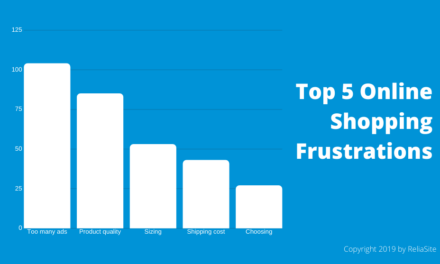
A helpful resource is a recent study we published that looks at what online shoppers care about beyond price and reviews. It covers aspects such as images, product descriptions, specs and other areas that relate to UX. It should be helpful when analyzing your abandonment rate and how you can improve it through better UX.
Resource: What Online Shoppers Want: We Surveyed Users to See What’s Important Besides Reviews and Price
UX KPI Metrics: Online Reviews
Online reviews are an excellent resource for data, feedback and discovering UX KPIs. What is your overall Yelp, Google My Business or Facebook rating? You want to be above that 4-star mark on pretty much any review site you run across. The good thing about review sites is that you can go on there and read what people are saying about your business. The bad thing about review sites is that you can go on there and read what people are saying about your business.
Yes, it can be harsh or hard to read, but it’s important to do. Why are you an overall 3-star rating? Oh, they’ll tell you why! But make sure to read, find common complaints and if it relates to UX, fix it! Then use the review rating as benchmark UX KPI.
Also, keep in mind you’ll come across some silly stuff that should be ignored. Just take a look at these real reviews of national parks…

UX KPI Metrics: Retention Rate
Driving new leads is great but sometimes there is no better customer than the existing customer. Retention rates calculate the percentage of your customers that you retain and continue using your service over time. The parallel for retention rate with an ecommerce site would be a reorder rate (a metric that calculates the number of reorders you get from past customers).
Retention rate is a UX KPI metric that tells you two main things – if your product was useful and useable/findable.

Useful – Does your service allow your customer to achieve their goal? Netflix’s job is to provide a steady flow of quality content the user will enjoy watching. If their retention rate drops or is poor, then they might need to look at the content their producing and modify the UX IE modifying the usefulness of their platform.
Useable/Findable – If your retention rate is low, then you need to analyze the usability of your product IE is it easy, smooth and efficient to achieve the goal. If Netflix has excellent content in terms of quality, then maybe users aren’t navigating through the platform with ease. Are they getting bombarded with ads or, looking at the findability side of things, can they easily weed through content to truly enjoy the variety? Does the search feature work well?
These are all key UX areas to look at when your retention rate is low and from there, it will stand as a benchmark to gauge if you are improving your usefulness, usability and findability.
There you have it, folks. UX KPI metrics that can help you measure success and indicate what areas may need to be improved. Good luck with your future projects!


